Portfolio
I help brands speak their own language.
Clearly, consistently, and authentically.
Branding | Social & Campaigns | Print & Packaging | Illustration
ONIGO
Branding + Packaging + Illustrations
Antwerp, 2026
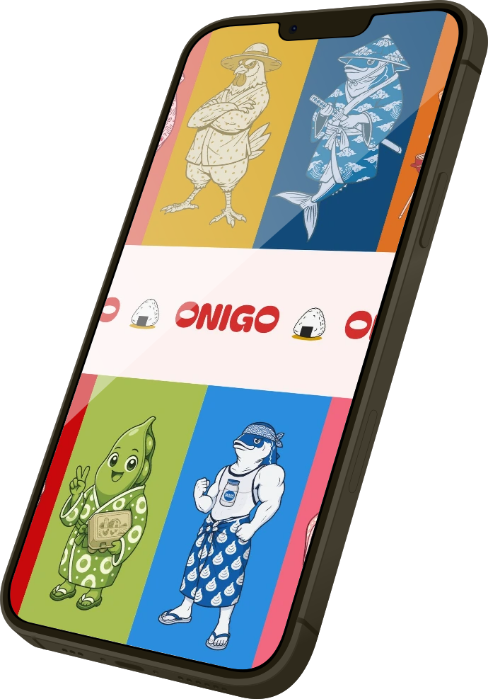
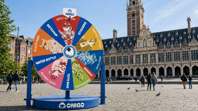
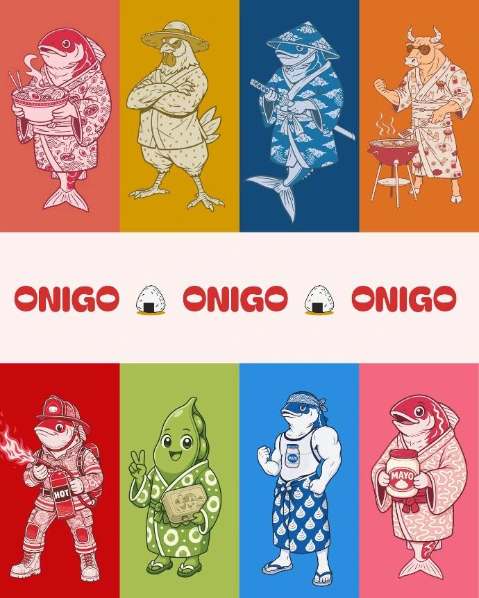
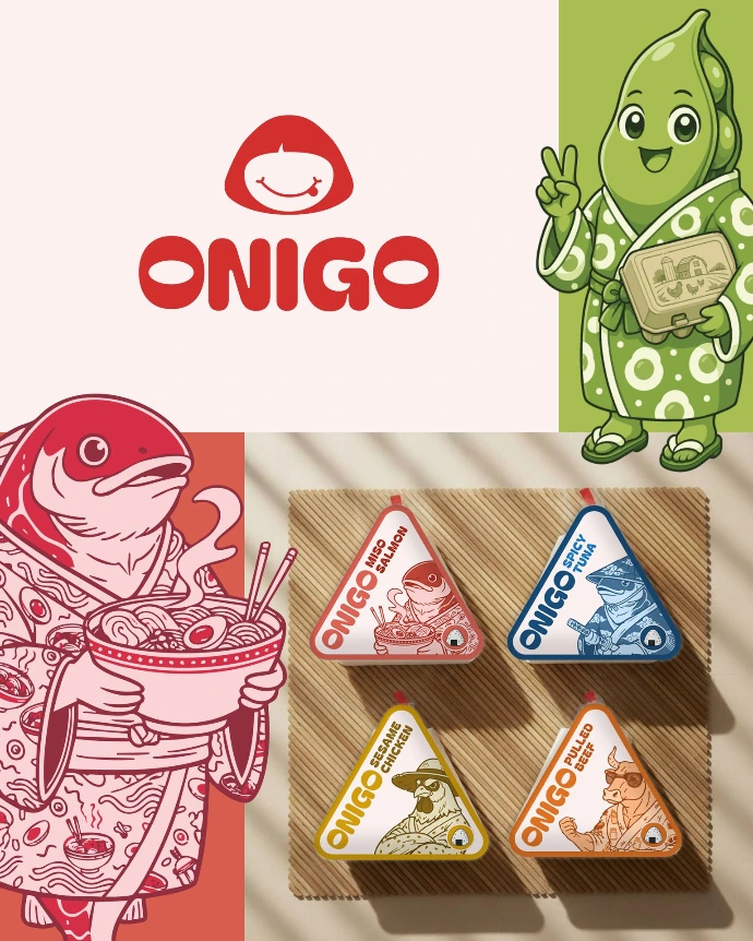
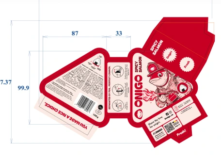
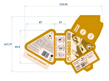
For ONIGO, I created a complete brand world for a Belgian food start-up bringing freshly made, Asian-inspired onigiri to the grab-and-go market. The work covered brand identity, illustrations, packaging & print materials shaping how the product looks, feels and speaks from first discovery to the shelf.
The challenge was to introduce onigiri as a fresh, accessible and desirable everyday food option in Belgium. Rather than treating packaging as a separate final step, I built a visual system that connects brand character, product clarity and retail impact. Every element, colour, typography, layout, product hierarchy and tone of voice was designed to make ONIGO recognisable, approachable and easy to choose quickly.
The result is a coherent, shelf-ready brand that helps a new category stand out in a competitive convenience-food environment. ONIGO has expanded to more than 35 stores across Belgium within its first five months, bringing the product to new locations and introducing onigiri to thousands of customers. Its products also received the Gault&Millau Best DreamVille Experience at epic Tomorrowland.
NGRAVE
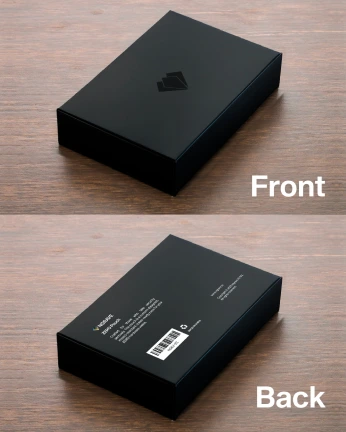
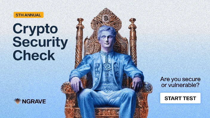
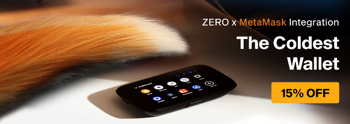
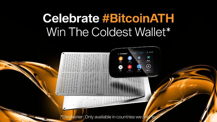
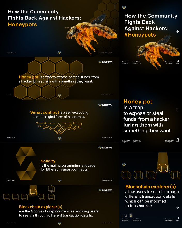
Digital campaigns, paid and organic social content, web/ shop visuals, motion, presentations, product communication, printed instructions and packaging.
Brussel, November 2021 to December 2025
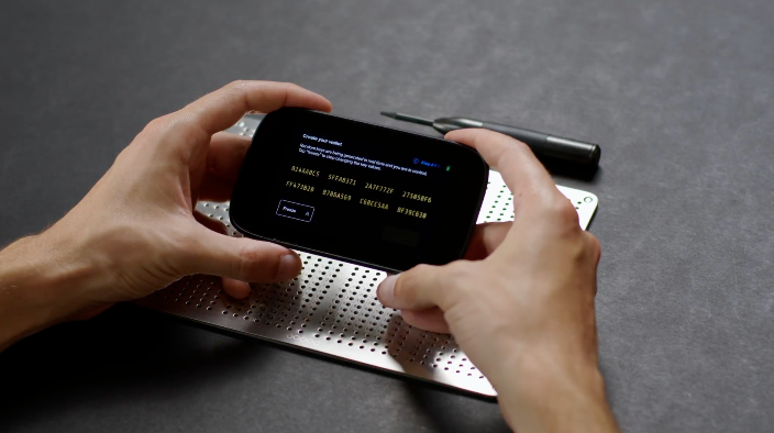
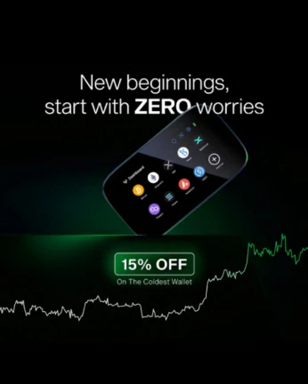
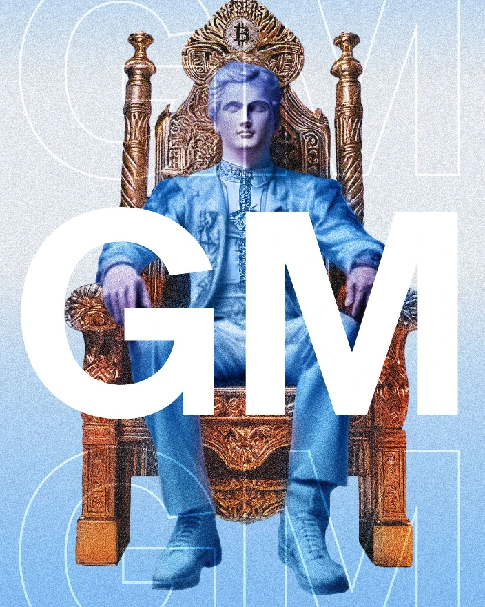
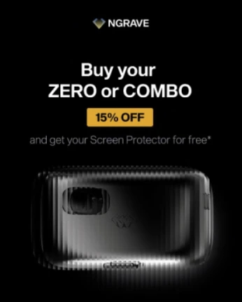
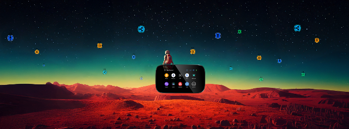
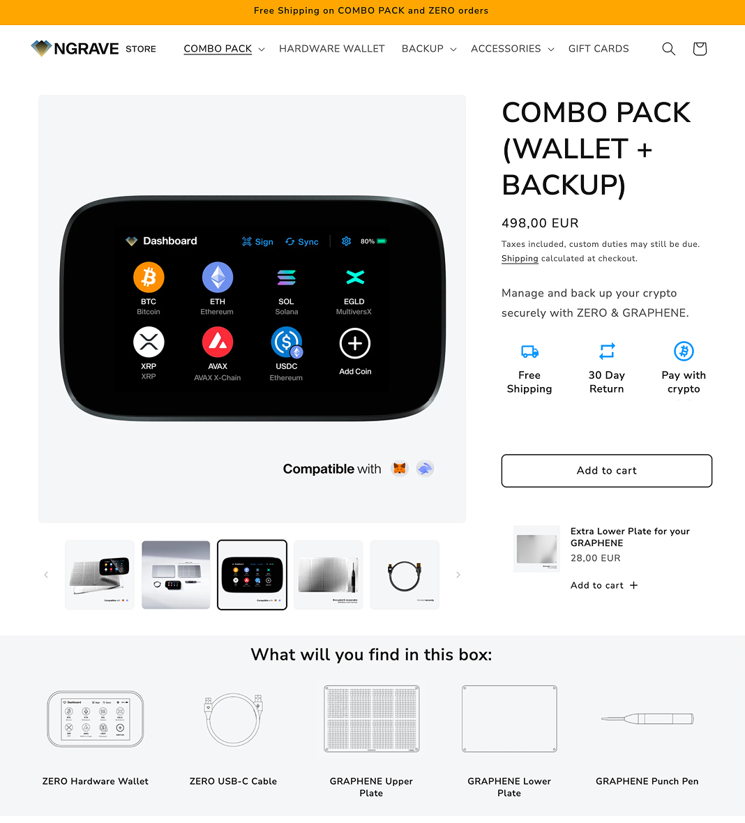
At NGRAVE, I worked as a Senior Graphic Designer, helping shape the visual expression of a Belgian technology company developing premium, high-security self-custody products for digital assets. NGRAVE’s product ecosystem combined the ZERO air-gapped hardware wallet, GRAPHENE steel backup and LIQUID companion app — translating complex security technology into a clear, trustworthy and premium customer experience.
I worked across digital campaigns, paid and organic social content, web visuals, motion, presentations, product communication, print, and packaging. My role involved turning product features, brand ambitions and marketing objectives into coherent visual stories that could work across every touchpoint.
A key part of my work was developing a strong, consistent brand world around a highly technical product: making security feel not only credible, but also understandable, desirable and human. I collaborated closely with marketing and brand stakeholders, led creative direction for campaign work, and developed assets that supported some of the company’s top-selling campaigns.
Polonia Cantante
Logo & visual identity WIP
Leuven, 2026
For Polonia Cantante, I created a logo built around a contemporary interpretation of the treble clef. The sign translates this familiar musical symbol into a bold, simplified form inspired by the flowing curves, organic rhythm, and ornamental elegance of Art Nouveau.
Rather than reproducing a traditional treble clef, I reduced it to a sequence of broad, interwoven lines. The result retains the essence of the musical notation while becoming a more distinctive and flexible symbol: one that suggests voice, movement, resonance, and the continuous flow of melody.
The visual direction draws from Brussels’ Art Nouveau heritage, particularly the atmospheric interiors and decorative language associated with the Musical Instruments Museum. Curved ironwork, stained-glass rhythms, structural arches, and the transition between ornament and architecture informed the mark’s fluid construction. The reference is not literal; it is translated into a clean, contemporary visual language that works across both cultural and digital contexts.
The logo connects three ideas in one gesture:
Music — through the recognisable structure of the treble clef
Brussels and Art Nouveau — through its organic, flowing line and ornamental rhythm
Contemporary identity — through a simplified silhouette that remains clear, memorable, and highly adaptable
Designed for concert posters, programmes, social media, event communication, and digital applications, the identity gives Polonia Cantante a visual voice that is expressive, elegant, and unmistakably its own.
Plug & Chill
Branding
Krakow, 2026
For Plug & Chill, I designed a friendly and accessible visual identity for a network of social electric-vehicle charging stations in Kraków. The brand needed to make charging feel simple, welcoming, and part of everyday urban life — rather than something technical, intimidating, or reserved for specialists.
The logo combines a minimal charging-related symbol with a smiling face. Its rounded shape suggests a plug, a socket, and a charging point, while the curved smile introduces a human and optimistic dimension. The result is a symbol that communicates the brand’s promise immediately: plug in, take a break, and enjoy the moment.
The simplified icon is clear at a distance and remains legible across different sizes, from the charging unit itself to digital interfaces, signage, social media, and promotional materials.
The identity was designed to stand out in Kraków’s urban landscape while remaining friendly enough to become part of the city’s everyday rhythm. Applied to the charging station, the logo transforms a functional object into a recognisable public touchpoint. One that feels modern, useful, and inviting.
Mindspeller
Video, event communication
Herent, 2026
For Mindspeller, I designed visual assets for its presence at the SuperNova Job Fair in Antwerp and created an explainer video introducing the company’s neuroprofiling approach.
Mindspeller is a Belgian neurotechnology company connected to KU Leuven research. Its work focuses on neuroprofiling: using brainwave-based insights to help people understand how they think, learn, make decisions, and identify career directions that fit them.
For the SuperNova activation, I developed event graphics that helped Mindspeller stand out in a busy, high-energy environment. The visuals were designed to make a complex topic feel approachable, relevant, and engaging for students and early-career visitors. They supported a live experience where attendees could explore Mindspeller Neuroprofiling face to face.
Alongside the event work, I created an explainer video that introduced what Mindspeller is, what neuroprofiling means, and how the company translates brain-related insights into a more personal approach to career orientation. The purpose was to turn a technical and unfamiliar subject into a concise, accessible visual story.
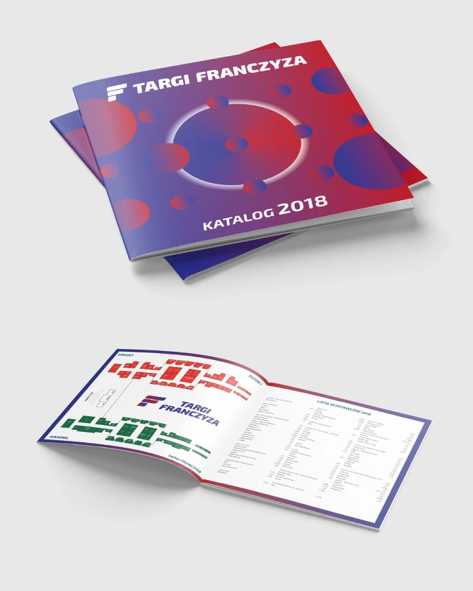
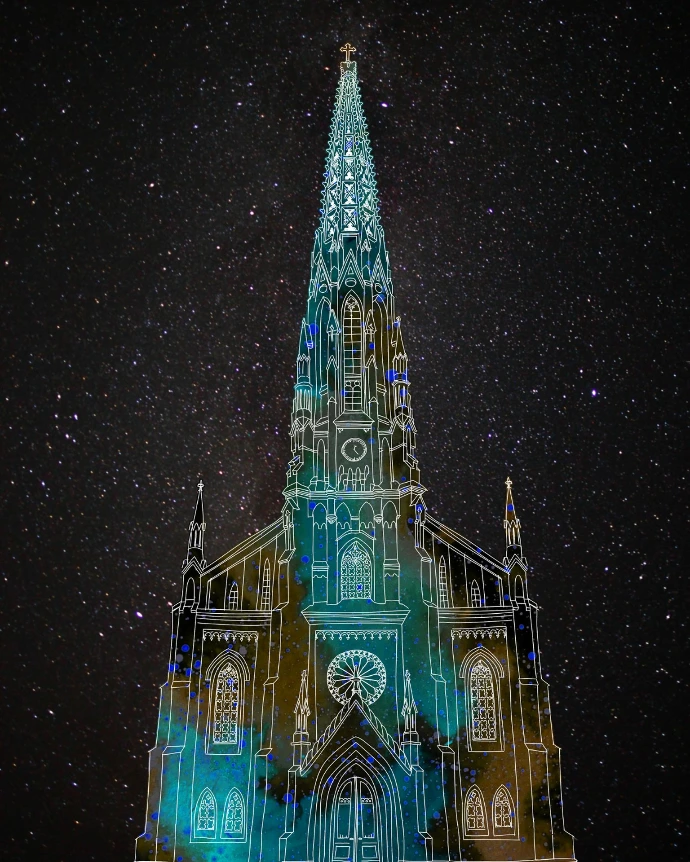
Other designs
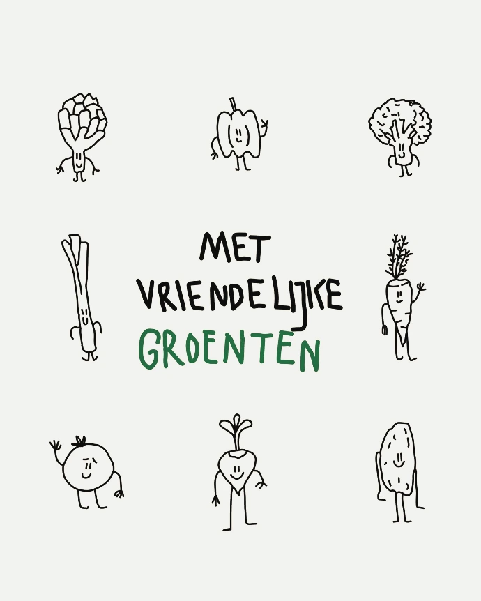
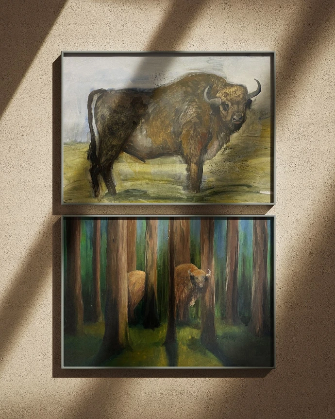
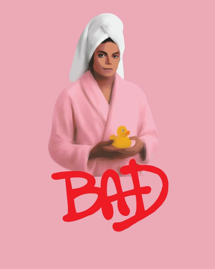
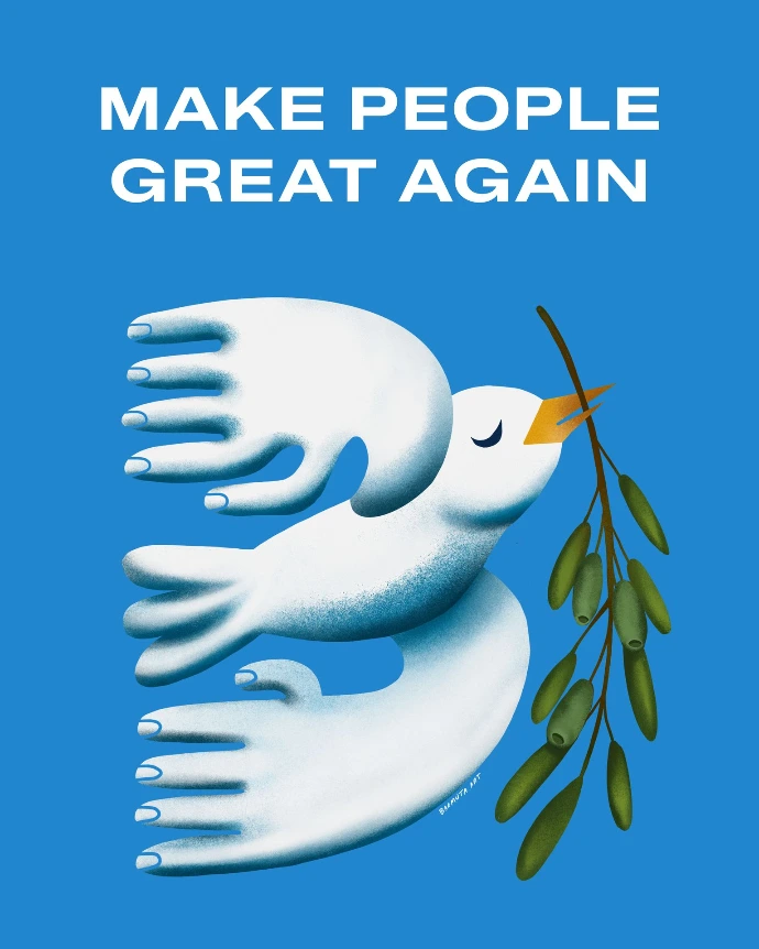
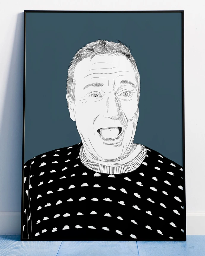
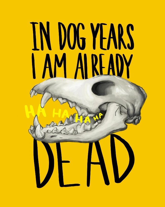
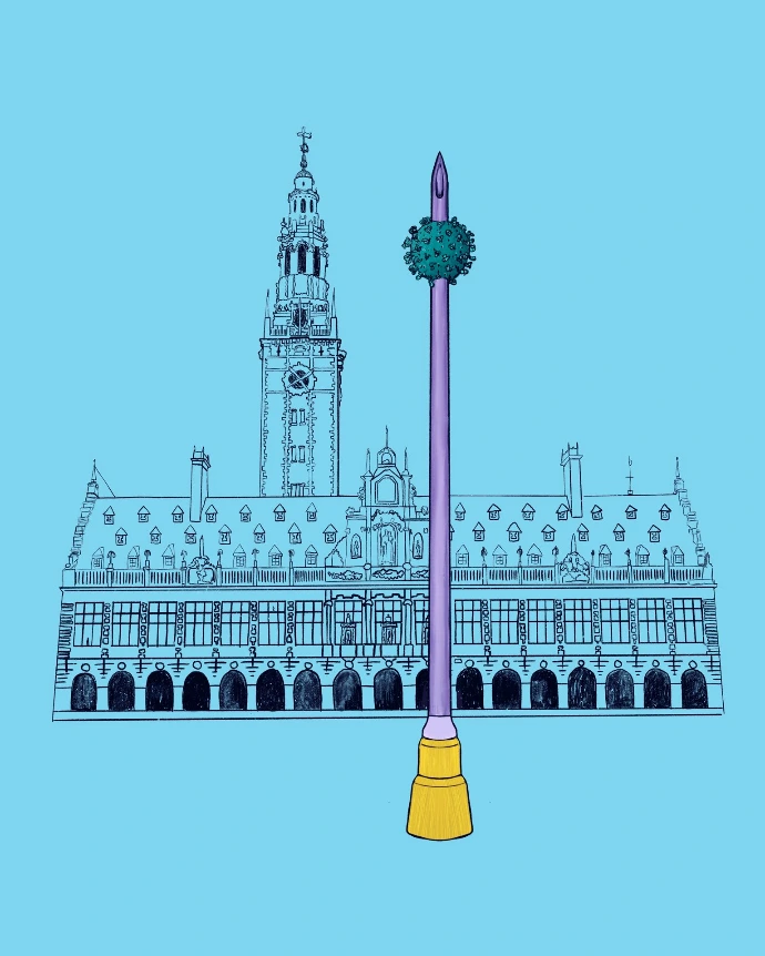
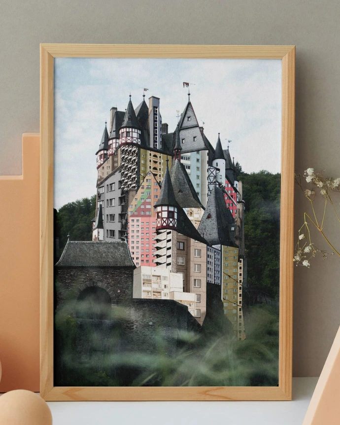
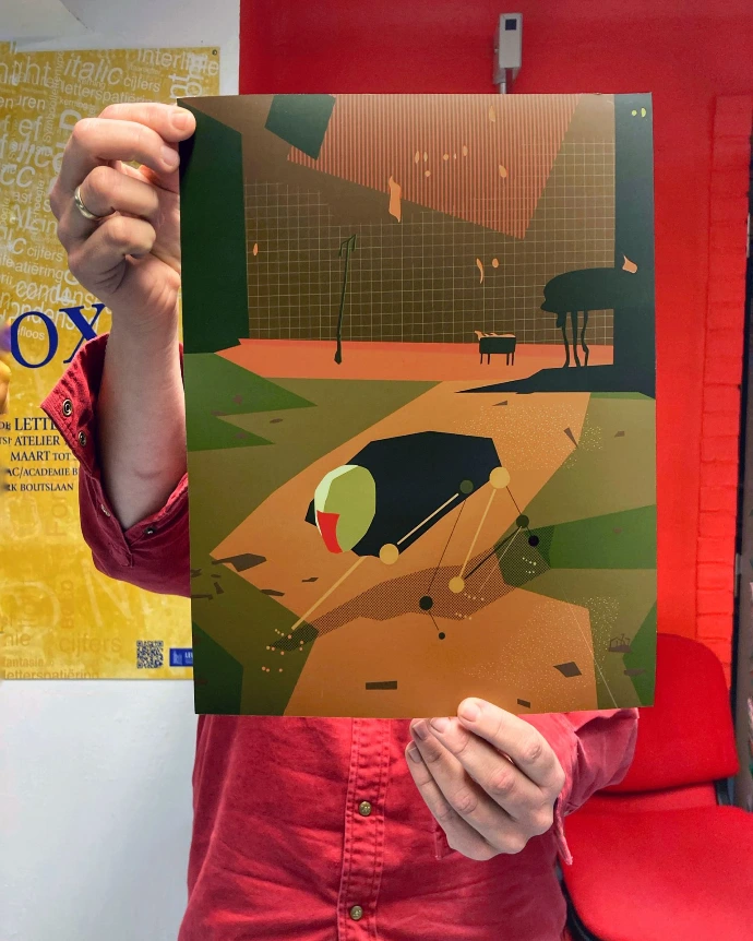
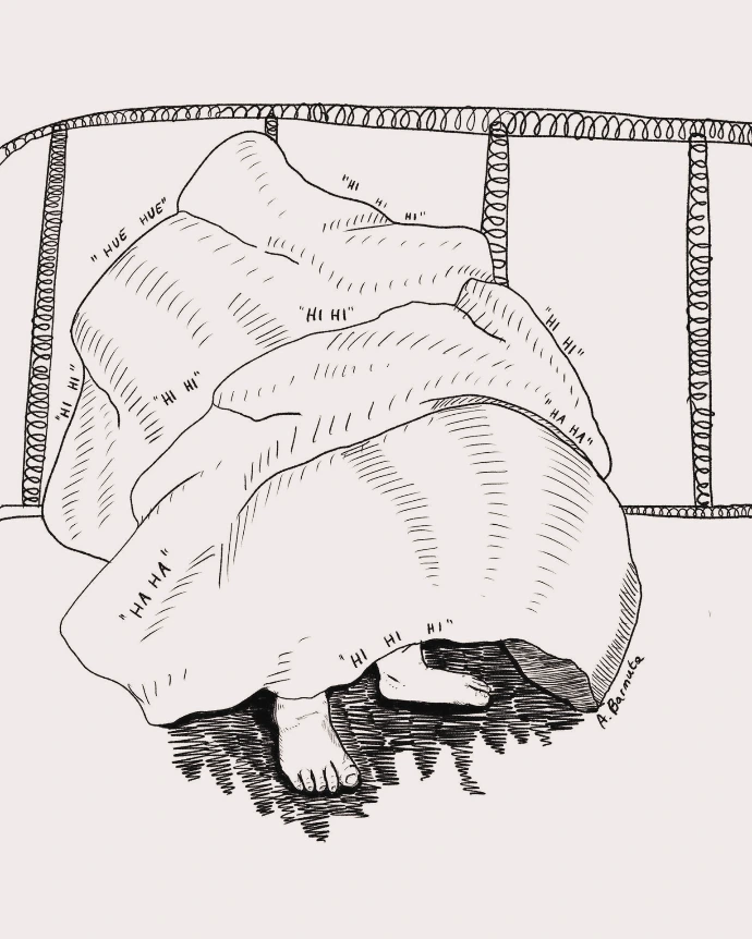
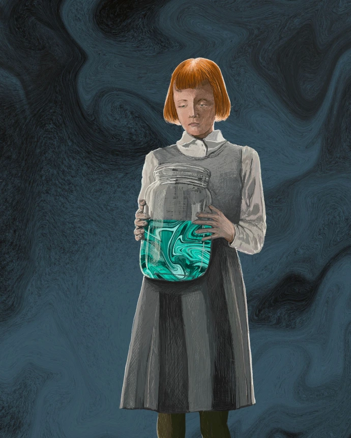
llustrations
Ready to start your next creative project?
Let’s chat about your ideas and turn them into something amazing.
Reach out today and let’s make magic together!
Copyright © mrmr Aleksandra Barmuta